
Role :
Founding Product Designer
Company :
Amhype
Duration :
2023 - 2025
Redesign Sprint :
4 weeks
Overview
Amhype is an anime-inspired streetwear brand based in Chennai. As the founding product designer, I led the end-to-end redesign of the e-commerce experience, from research and UX strategy to wireframes and final UI. The original site, built on a Wix template, helped launch quickly but failed to scale with a growing community and high-demand product drops. The goal was to transform the experience into something that matched the hype, energy, and collectibility of anime culture while improving usability and conversion.
Problem
The original Amhype website was built using a Wix template to enable a quick launch, but it struggled to scale with a growing audience and high-demand product drops. As the brand evolved, the experience introduced several usability and trust issues that impacted product discovery and purchasing decisions.
Cluttered layout with multiple competing sections reduced visual hierarchy
Product discovery was inefficient due to poor grouping and navigation structure
Lack of clear categorization across drops, collections, and product types
Weak visual consistency reduced perceived brand trust and quality
The experience did not build excitement or urgency during product launches
High information density made it difficult for users to quickly scan and decide
EXISTING EXPERIENCE (BEFORE REDESIGN)
The original interface relied on a template-based structure that prioritized speed of launch over user experience and scalability. While functional, it lacked the clarity, structure, and brand expression needed to support a growing streetwear audience.
Cluttered layout • Weak hierarchy • Poor product discovery
Weak hierarchy • Low trust signals
Unclear checkout flow • Low conversion confidence
GOALS
• Make product discovery faster and more intuitive
• Help users feel confident enough to buy
• Bring Amhype’s hype-driven identity into the experience
• Design a system that can scale with future drops
RESEARCH & INSIGHTS
To understand what Amhype users actually needed, I looked beyond the interface combining community feedback, competitor patterns, and real interactions from events.
KEY INSIGHTS
Three patterns stood out:
• Trust needs to be visible early, users hesitate without clear signals
• Drops should feel exciting and front and center, not buried
• Checkout must be fast and frictionless, especially on mobile
USER TYPES
I identified three core user types shaping the experience:
01 Drop Hunter
Moves fast and wants limited drops before they sell out
02 Collector
Cares about authenticity, quality, and trust
03 Casual Shopper
Prefers simple browsing and low-effort navigation
USER JOURNEY
To understand where users struggled, I mapped the journey from discovering Amhype to completing a purchase.
Discovery
→
Browsing
→
Product
→
Cart
→
Checkout
The biggest friction points appeared at the beginning and end of the journey, where users either felt overwhelmed or lacked confidence to complete a purchase.
COMPETITOR INSIGHTS
• To understand industry patterns, I analyzed both global and local competitors in the anime merchandise space.
• Some platforms leaned heavily into hype but lacked clarity and usability.
• Others built strong trust through structure and transparency but felt less engaging.
• This revealed an opportunity to combine hype-driven design with clarity and trust into a single cohesive experience.
A quick breakdown of key competitors:
ComicSense
Strong hype-driven visuals and drop culture
But cluttered layouts reduce clarity and usability
The Souled Store
Clear structure and strong trust signals
But lacks excitement and drop-driven energy
Crunchyroll Store
Clean navigation and browsing experience
But less focus on exclusivity and hype
INFORMATION ARCHITECTURE
After identifying issues in navigation, discoverability, and clarity, I restructured the experience into a clear and scalable system.
The goal was to guide users from discovery to purchase while reducing friction across key touchpoints.
These patterns revealed a gap in how hype, clarity, and trust were combined, shaping the direction of my redesign.
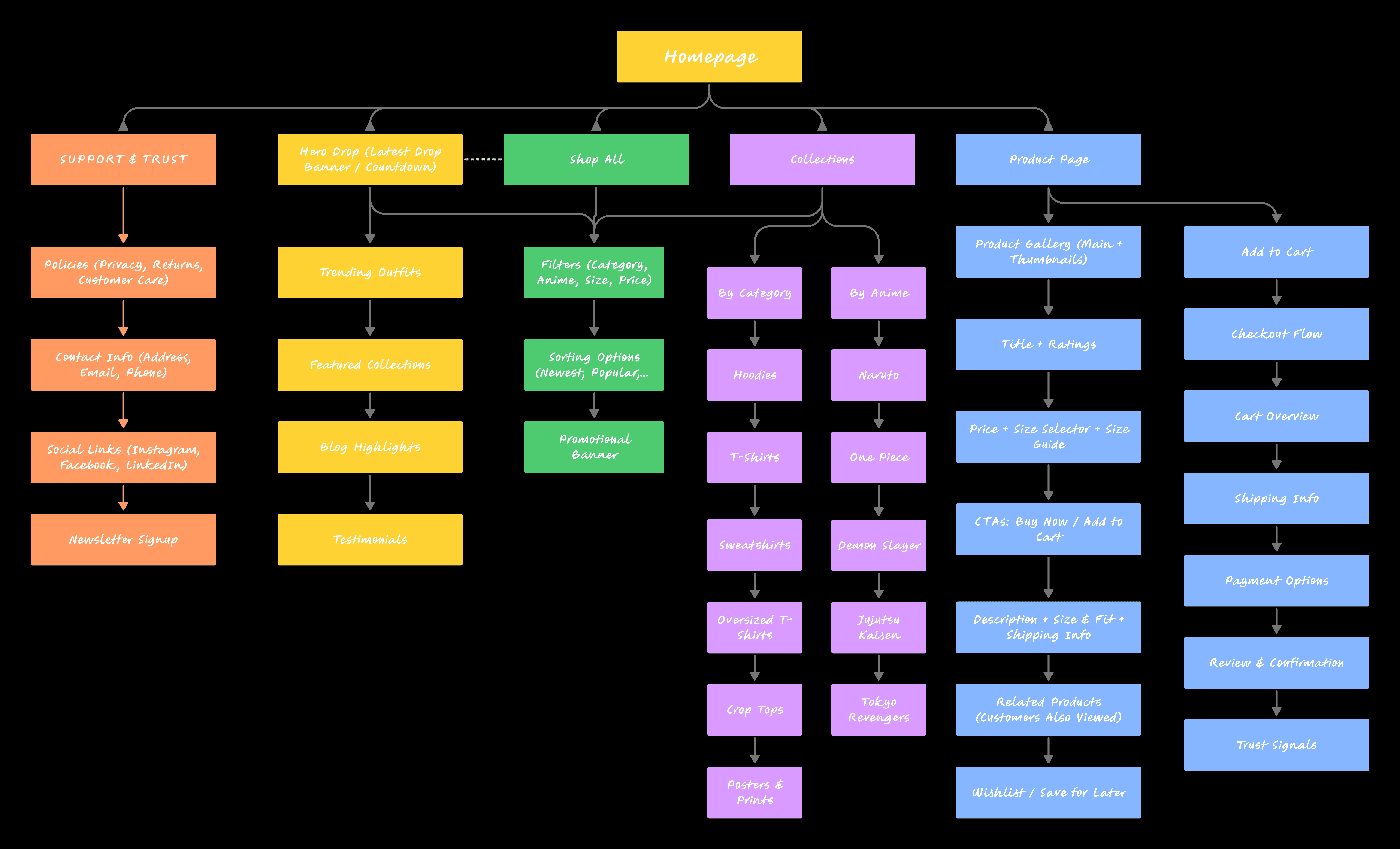
This structure simplified navigation, improved product discovery, and created a more seamless path from browsing to checkout.
WIREFRAMES & STRUCTURE EXPLORATION
• With the structure defined, I translated key flows into low-fidelity wireframes to validate layout, hierarchy, and user flow.
• I focused on simplifying product discovery, reducing clutter, and making key actions like add-to-cart and checkout more intuitive.
• These wireframes helped identify usability gaps early and ensured the experience was clear and scalable before moving into high-fidelity design.
Homepage
Product Page
Collection / Shop
Checkout Flow
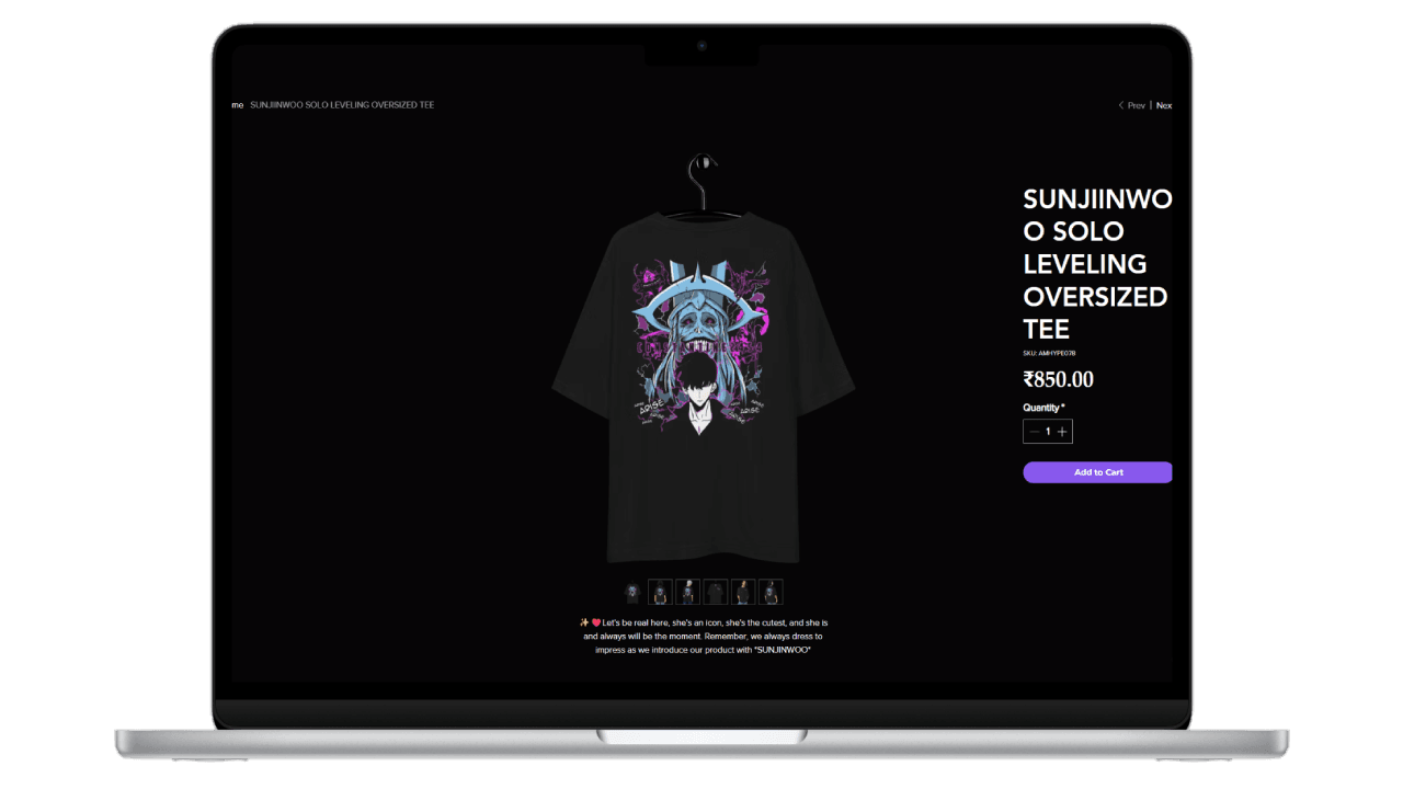
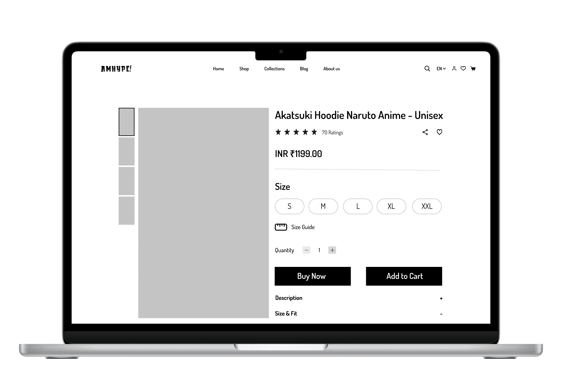
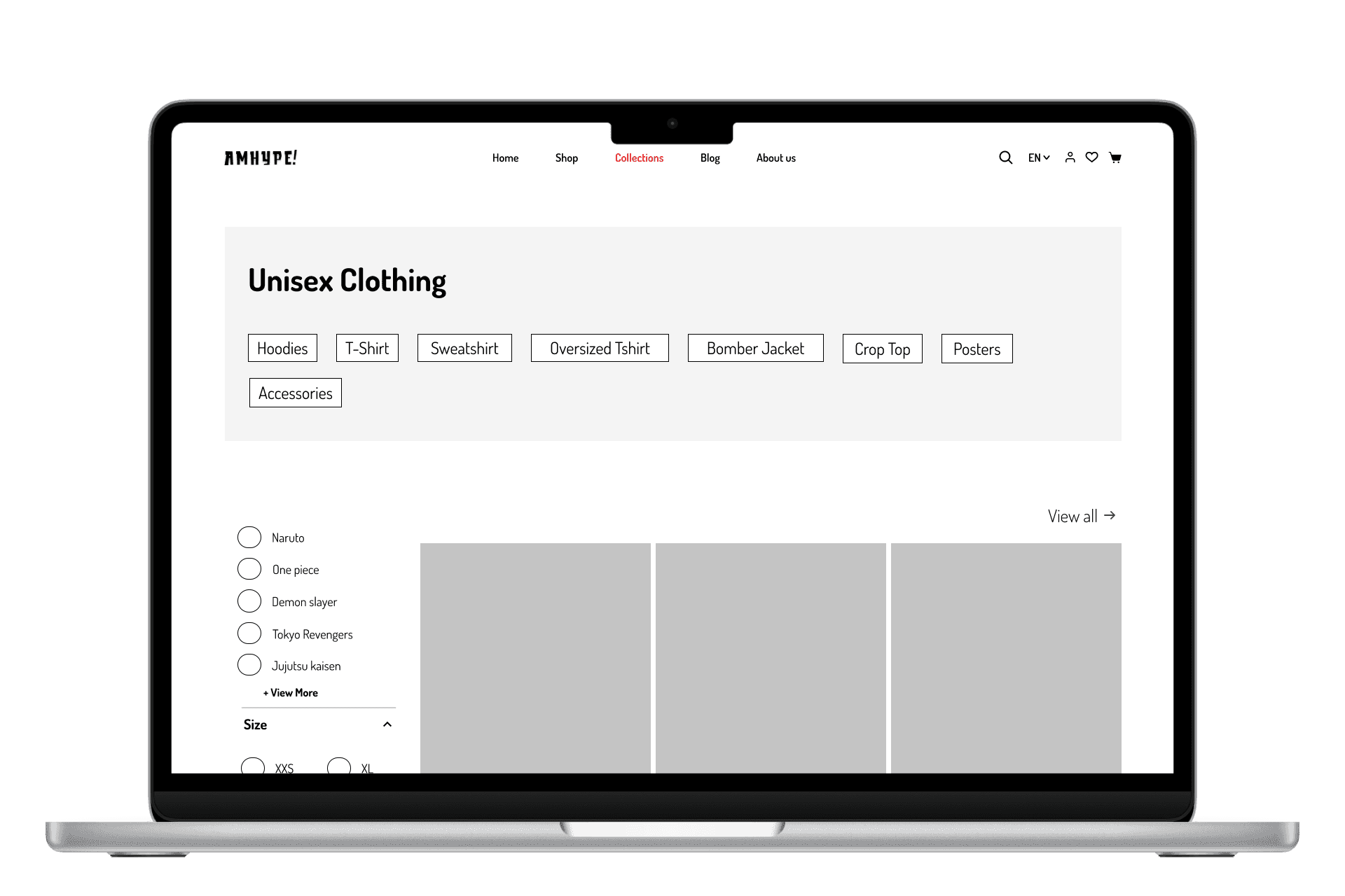
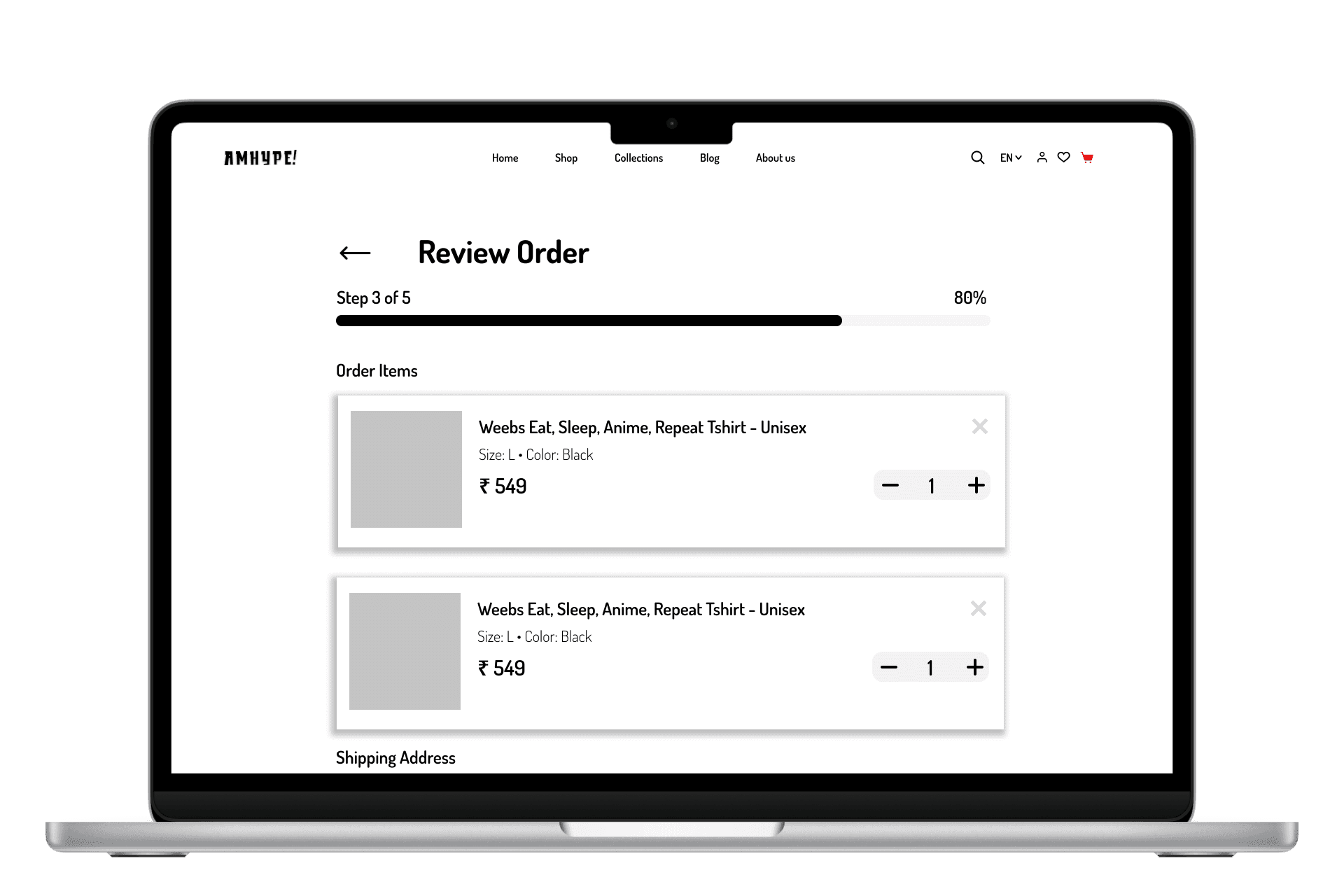
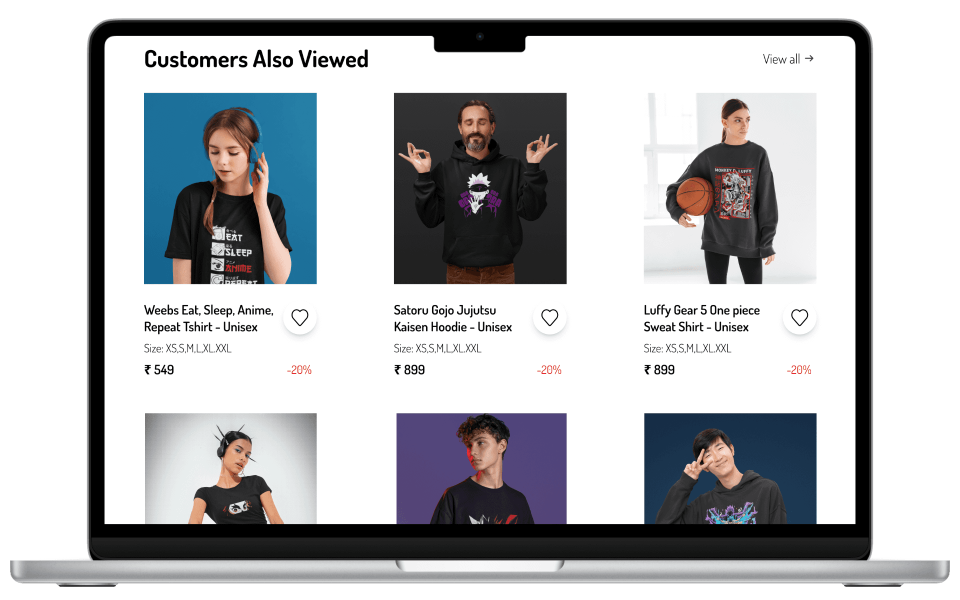
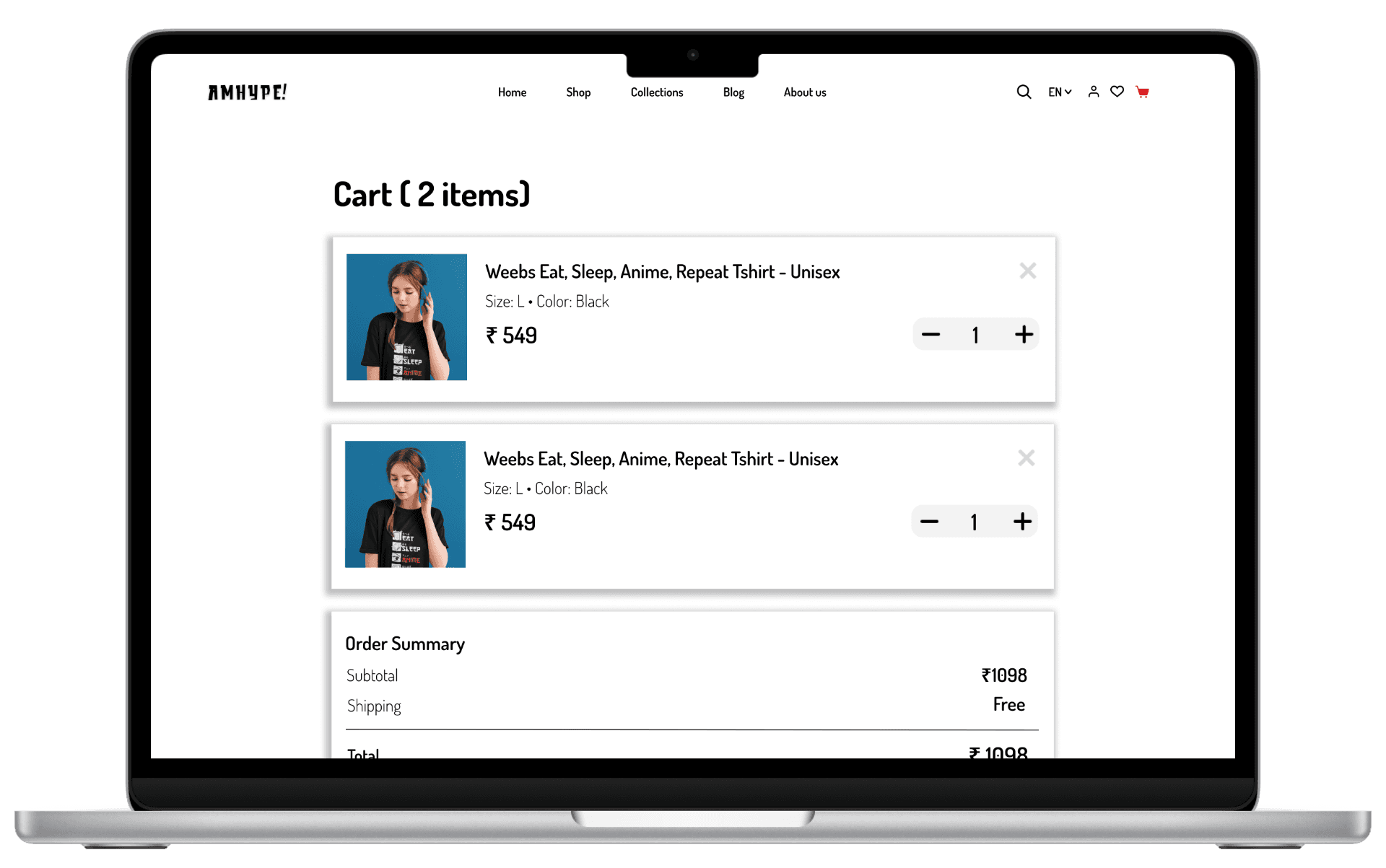
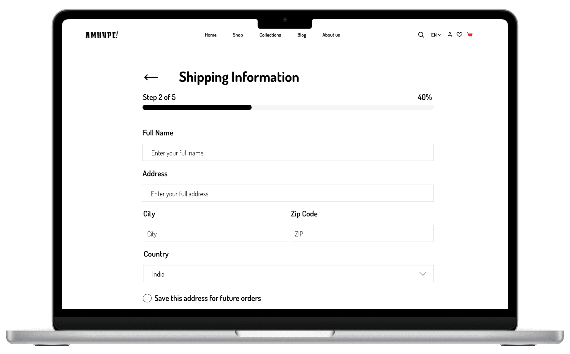
HIGH-FIDELITY DESIGN
• Building on the validated wireframes, I translated the experience into high-fidelity designs focused on clarity, trust, and a strong hype-driven brand identity.
• The goal was to create a visually engaging yet structured experience that improves product discovery, reduces friction, and helps users feel confident while making a purchase.
• Each screen was designed to balance aesthetics with usability, ensuring the platform feels both exciting and easy to navigate.
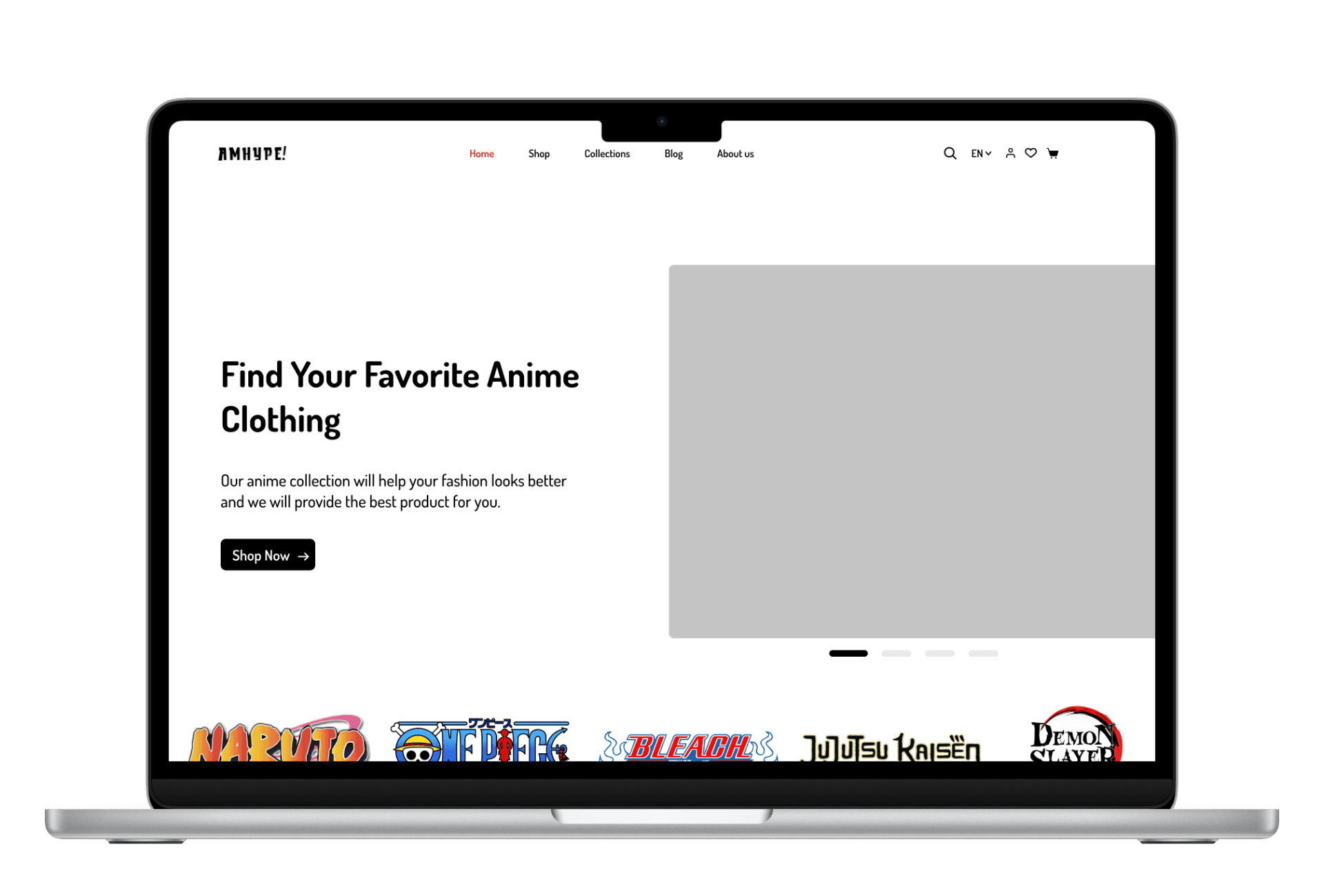
Homepage
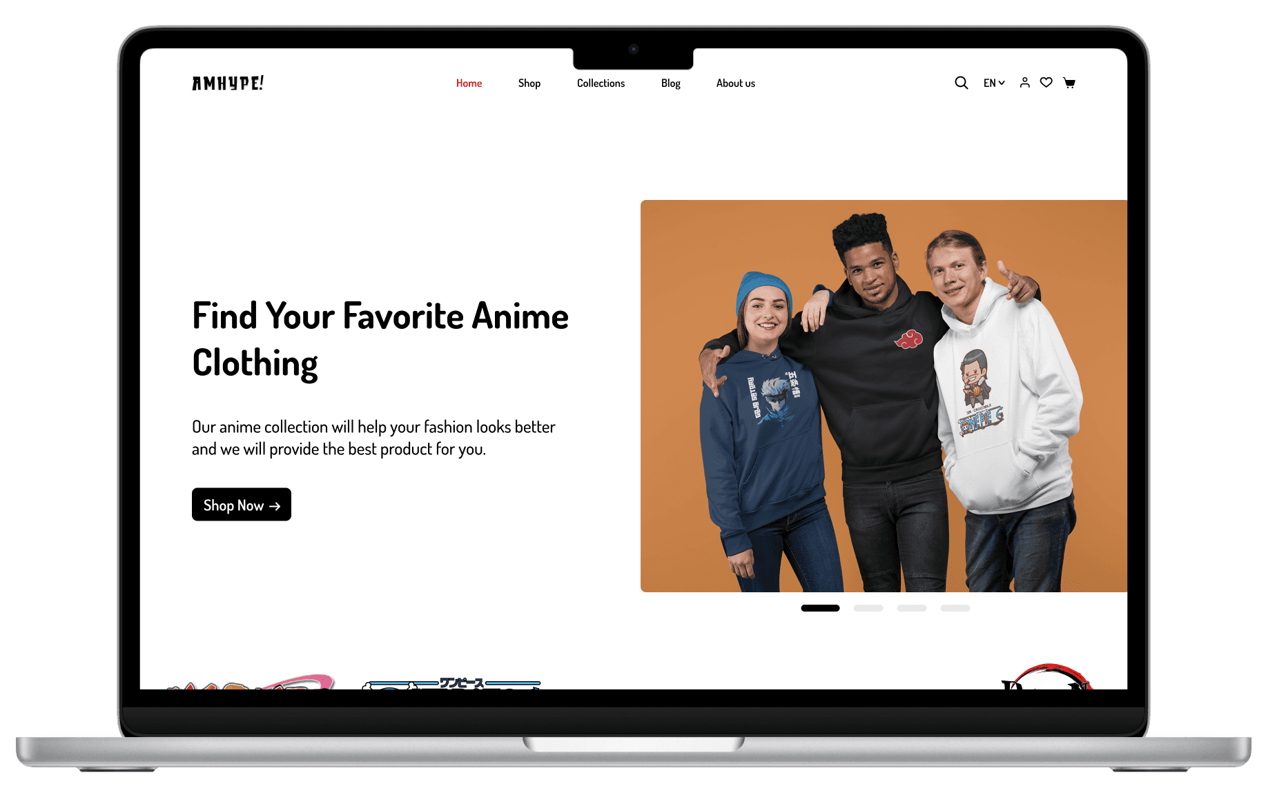
Drop-focused entry experience
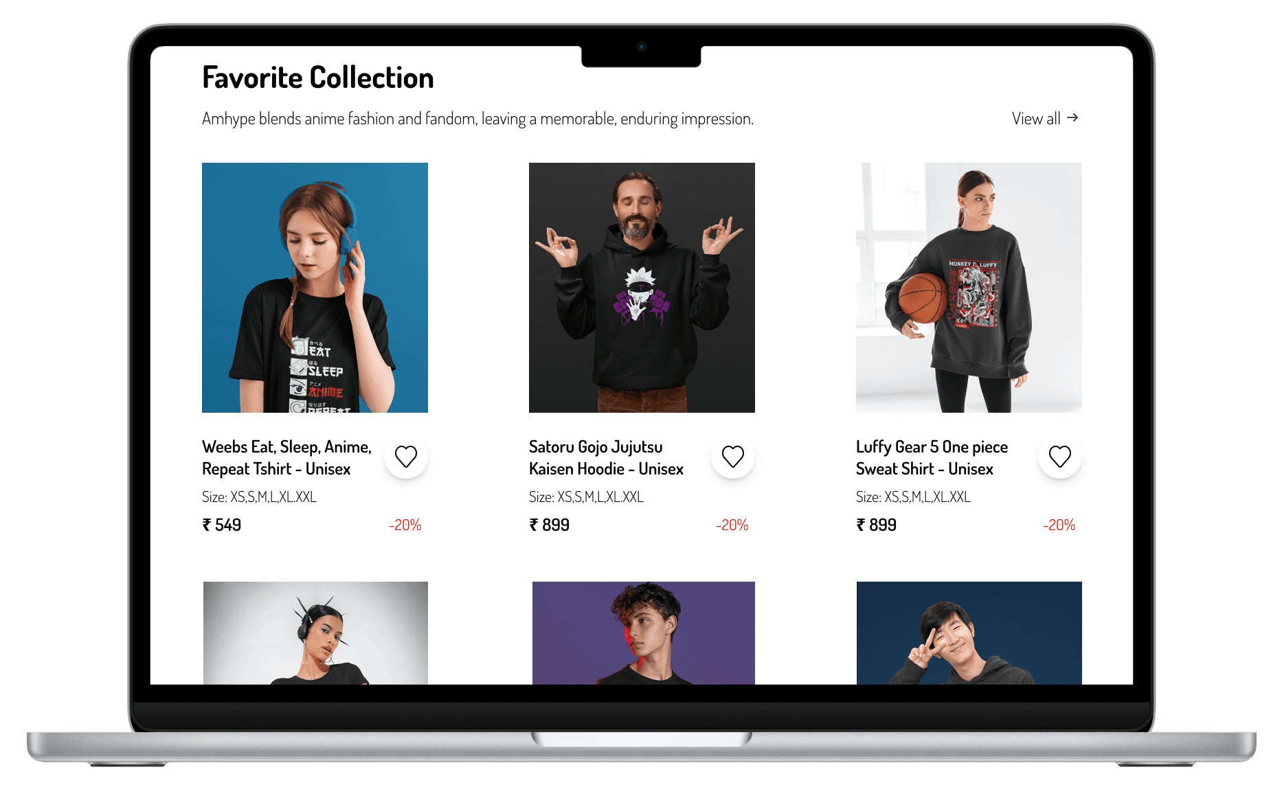
Structured product discovery
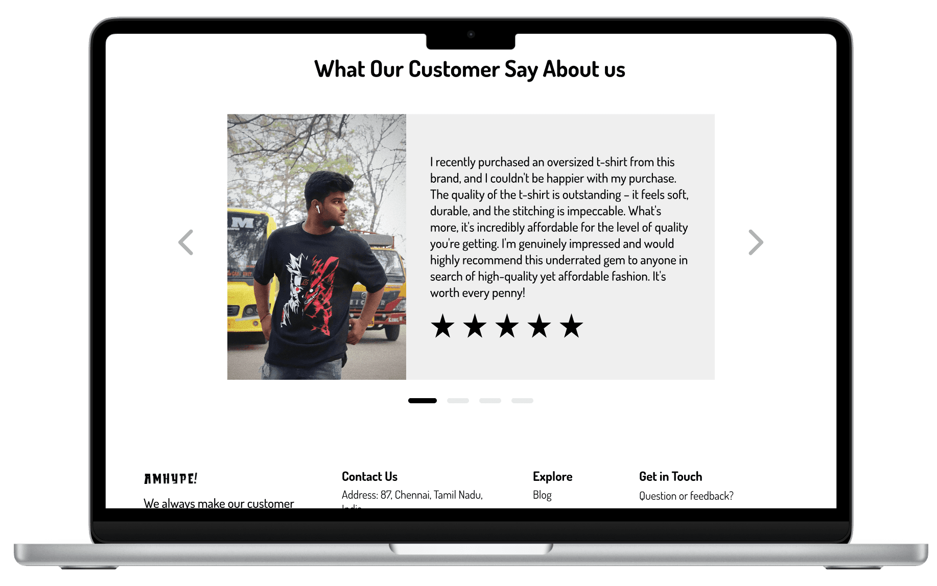
Building trust through social proof
Product Discovery
Collection
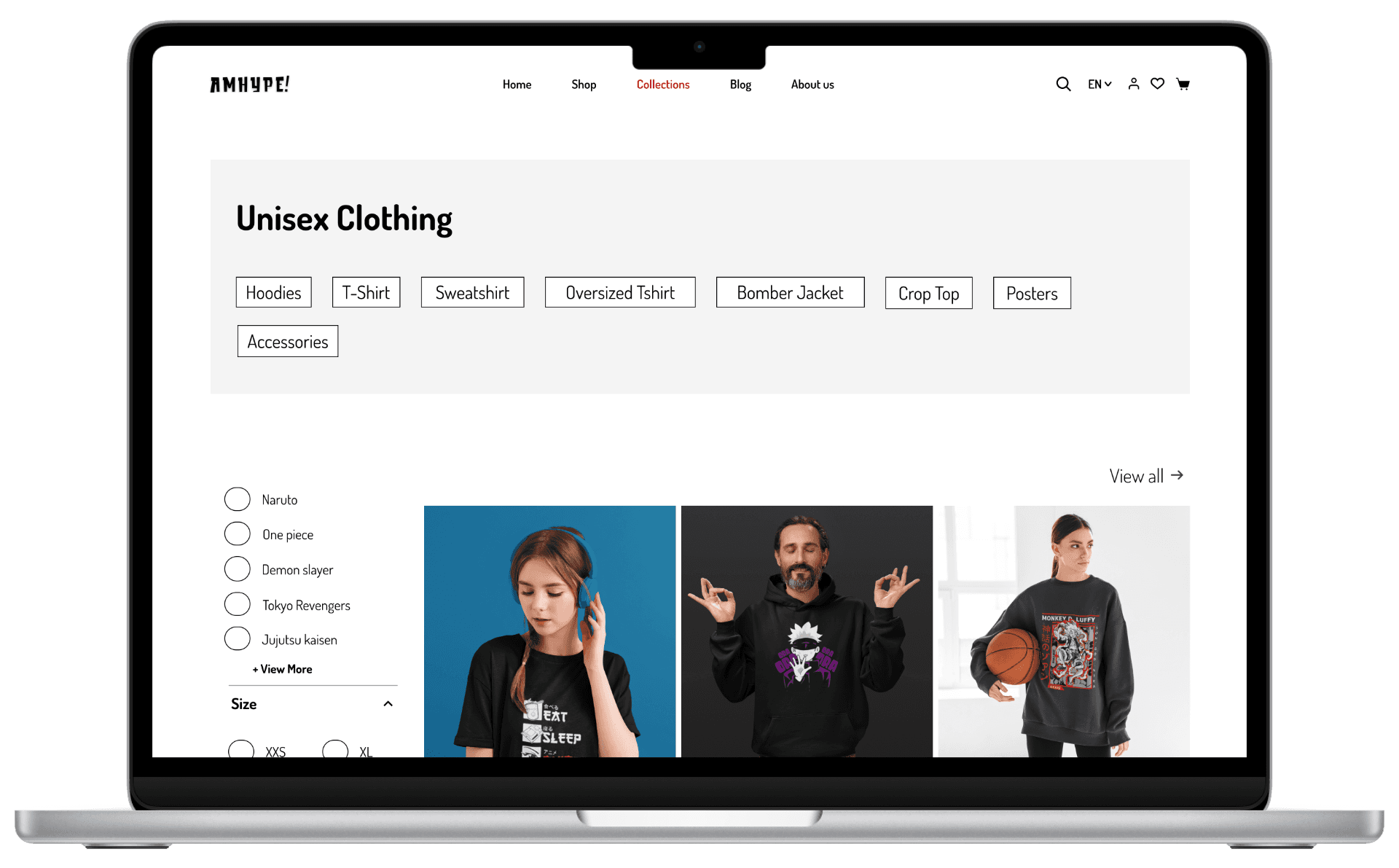
Shop
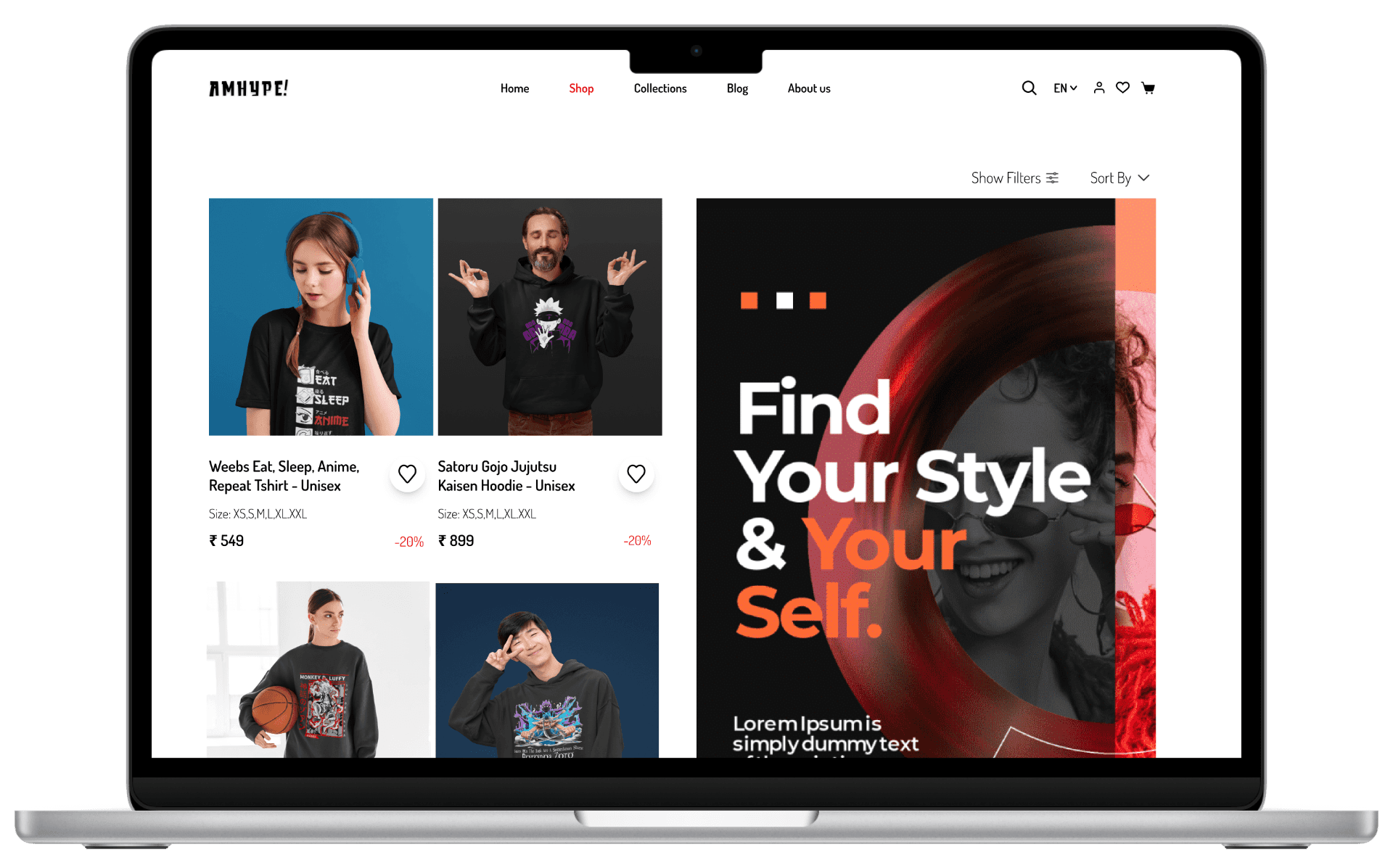
Product Detail
Product Detail
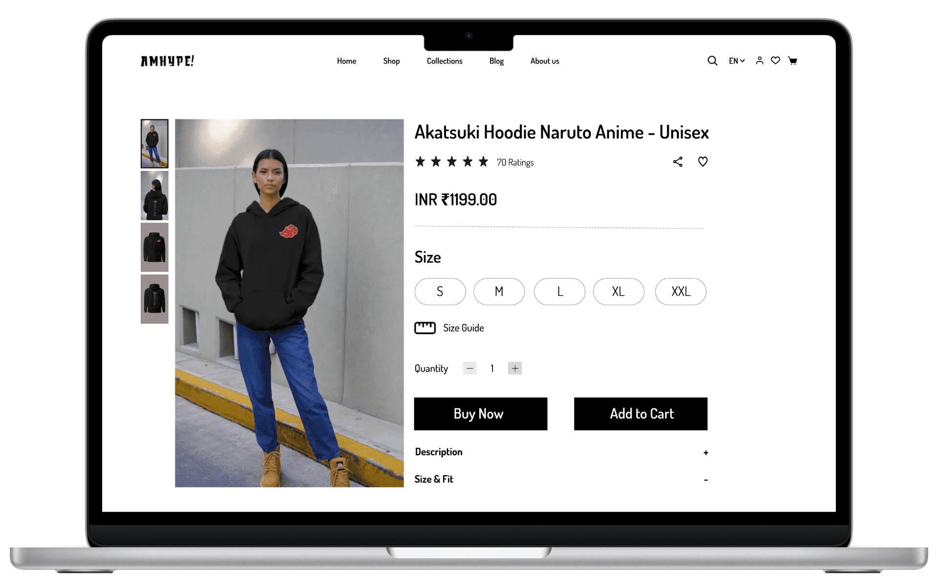
Related Products
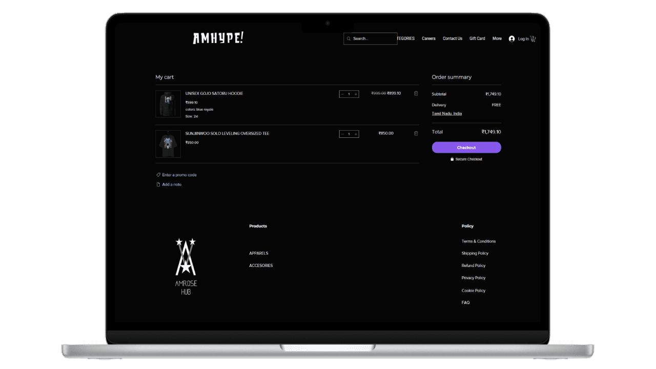
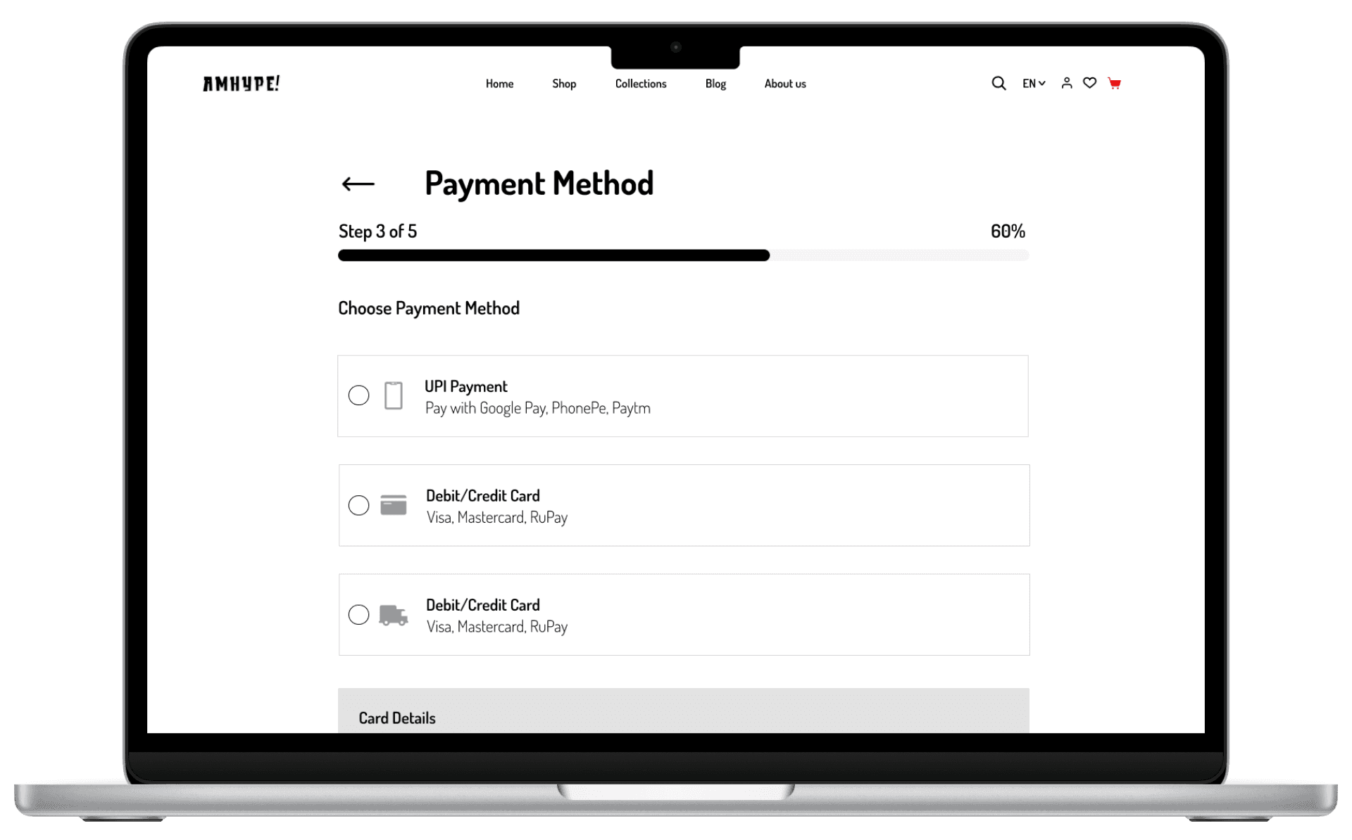
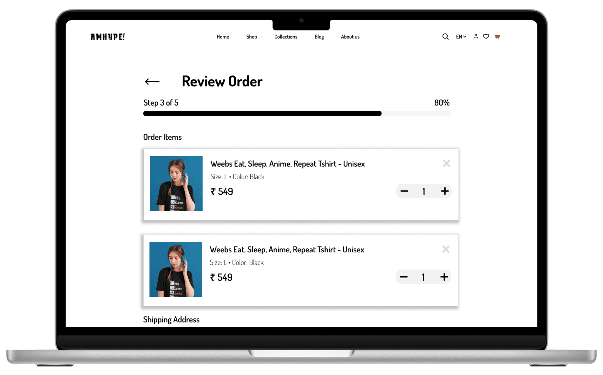
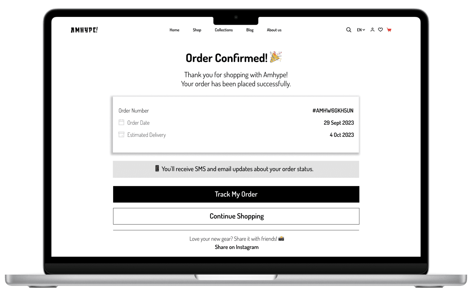
Checkout Flow
Cart
Shipping Information
Payment
Review Order
Order Confirmation
Solution
• The final solution combines a hype-driven visual identity with a structured and intuitive shopping experience.
• Each step from discovery to checkout was designed to reduce friction, improve clarity, and guide users confidently toward purchase.
Impact
• Increased average session duration by 22% through improved navigation and visual hierarchy
• Reduced bounce rate by 17% by simplifying browsing and product discovery
• Boosted merchandise sales by 18% through clearer product presentation and marketing visuals
• Reduced design delivery time by 30% by streamlining workflows and design systems
Role :
Founding Product Designer
Company :
Amhype
Duration :
2023 - 2025
Redesign Sprint :
4 weeks
Overview
Amhype is an anime-inspired streetwear brand based in Chennai. As the founding product designer, I led the end-to-end redesign of the e-commerce experience, from research and UX strategy to wireframes and final UI. The original site, built on a Wix template, helped launch quickly but failed to scale with a growing community and high-demand product drops. The goal was to transform the experience into something that matched the hype, energy, and collectibility of anime culture while improving usability and conversion.
Problem
The original Amhype website was built using a Wix template to enable a quick launch, but it struggled to scale with a growing audience and high-demand product drops. As the brand evolved, the experience introduced several usability and trust issues that impacted product discovery and purchasing decisions.
Cluttered layout with multiple competing sections reduced visual hierarchy
Product discovery was inefficient due to poor grouping and navigation structure
Lack of clear categorization across drops, collections, and product types
Weak visual consistency reduced perceived brand trust and quality
The experience did not build excitement or urgency during product launches
High information density made it difficult for users to quickly scan and decide
EXISTING EXPERIENCE (BEFORE REDESIGN)
The original interface relied on a template-based structure that prioritized speed of launch over user experience and scalability. While functional, it lacked the clarity, structure, and brand expression needed to support a growing streetwear audience.
Cluttered layout • Weak hierarchy • Poor product discovery
Weak hierarchy • Low trust signals
Unclear checkout flow • Low conversion confidence
GOALS
• Make product discovery faster and more intuitive
• Help users feel confident enough to buy
• Bring Amhype’s hype-driven identity into the experience
• Design a system that can scale with future drops
RESEARCH & INSIGHTS
To understand what Amhype users actually needed, I looked beyond the interface combining community feedback, competitor patterns, and real interactions from events.
KEY INSIGHTS
Three patterns stood out:
• Trust needs to be visible early, users hesitate without clear signals
• Drops should feel exciting and front and center, not buried
• Checkout must be fast and frictionless, especially on mobile
USER TYPES
I identified three core user types shaping the experience:
01 Drop Hunter
Moves fast and wants limited drops before they sell out
02 Collector
Cares about authenticity, quality, and trust
03 Casual Shopper
Prefers simple browsing and low-effort navigation
USER JOURNEY
To understand where users struggled, I mapped the journey from discovering Amhype to completing a purchase.
Discovery
→
Browsing
→
Product
→
Cart
→
Checkout
The biggest friction points appeared at the beginning and end of the journey, where users either felt overwhelmed or lacked confidence to complete a purchase.
COMPETITOR INSIGHTS
• To understand industry patterns, I analyzed both global and local competitors in the anime merchandise space.
• Some platforms leaned heavily into hype but lacked clarity and usability.
• Others built strong trust through structure and transparency but felt less engaging.
• This revealed an opportunity to combine hype-driven design with clarity and trust into a single cohesive experience.
A quick breakdown of key competitors:
ComicSense
Strong hype-driven visuals and drop culture
But cluttered layouts reduce clarity and usability
The Souled Store
Clear structure and strong trust signals
But lacks excitement and drop-driven energy
Crunchyroll Store
Clean navigation and browsing experience
But less focus on exclusivity and hype
INFORMATION ARCHITECTURE
After identifying issues in navigation, discoverability, and clarity, I restructured the experience into a clear and scalable system.
The goal was to guide users from discovery to purchase while reducing friction across key touchpoints.
These patterns revealed a gap in how hype, clarity, and trust were combined, shaping the direction of my redesign.
This structure simplified navigation, improved product discovery, and created a more seamless path from browsing to checkout.
WIREFRAMES & STRUCTURE EXPLORATION
• With the structure defined, I translated key flows into low-fidelity wireframes to validate layout, hierarchy, and user flow.
• I focused on simplifying product discovery, reducing clutter, and making key actions like add-to-cart and checkout more intuitive.
• These wireframes helped identify usability gaps early and ensured the experience was clear and scalable before moving into high-fidelity design.
Homepage
Product Page
Collection / Shop
Checkout Flow
HIGH-FIDELITY DESIGN
• Building on the validated wireframes, I translated the experience into high-fidelity designs focused on clarity, trust, and a strong hype-driven brand identity.
• The goal was to create a visually engaging yet structured experience that improves product discovery, reduces friction, and helps users feel confident while making a purchase.
• Each screen was designed to balance aesthetics with usability, ensuring the platform feels both exciting and easy to navigate.
Homepage
Drop-focused entry experience
Structured product discovery
Building trust through social proof
Product Discovery
Collection
Shop
Product Detail
Product Detail
Related Products
Checkout Flow
Cart
Shipping Information
Payment
Review Order
Order Confirmation
Solution
• The final solution combines a hype-driven visual identity with a structured and intuitive shopping experience.
• Each step from discovery to checkout was designed to reduce friction, improve clarity, and guide users confidently toward purchase.
Impact
• Increased average session duration by 22% through improved navigation and visual hierarchy
• Reduced bounce rate by 17% by simplifying browsing and product discovery
• Boosted merchandise sales by 18% through clearer product presentation and marketing visuals
• Reduced design delivery time by 30% by streamlining workflows and design systems